Case Study

Minimalist Web Design for a Luxury Skincare Brand

Problem Statement

A premium skincare brand offering high-end, organic beauty products struggled with a cluttered, outdated website that failed to convey its luxury positioning. The overwhelming design, inconsistent branding, and poor mobile responsiveness led to low engagement, high bounce rates, and underwhelming conversion performance. The brand aimed to adopt a minimalist web design approach that reflected sophistication, improved usability, and aligned with its luxury image.

Minimalist Web Design

Challenge

Key challenges in the redesign process included:

  • Cluttered UI: Excessive visuals, text, and inconsistent layout created cognitive overload.

  • Brand Disconnect: The website didn’t reflect the elegance or exclusivity of the product line.

  • Mobile Experience: Poor responsiveness and slow mobile loading times drove users away.

  • Product Focus: Product benefits and features were buried, making it hard for users to find value quickly.

  • Performance: High-resolution images and unoptimized content slowed down the site.

Solution Provided

A minimalist design strategy was implemented to elevate the brand identity and enhance user experience. The solution focused on:

  • Clean Aesthetic: Leveraged whitespace, limited color palettes, and elegant typography.

  • Brand Storytelling: Used intentional space and minimal content to draw attention to brand values and product quality.

  • Visual Hierarchy: Focused user attention on high-priority elements like featured products, testimonials, and calls-to-action.

  • Mobile-First Design: Prioritized touch-friendly navigation and responsive design principles.

  • Performance Optimization: Compressed images, removed unnecessary scripts, and used lazy loading to speed up performance.

Development Steps

data-collection

Brand Discovery

Conducted workshops with the client to understand core brand values, target audience, and visual identity.

Wireframing & Prototyping

Designed low-fidelity wireframes with a focus on simplicity and clean structure.

execution

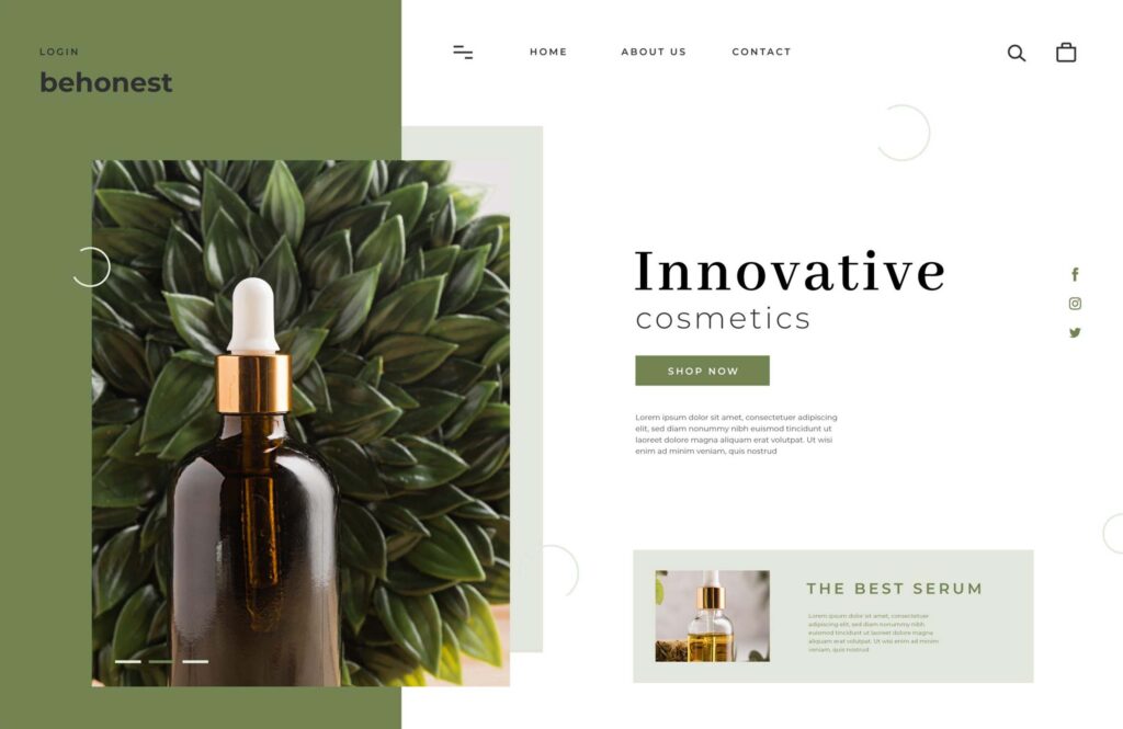
Design System Creation

Developed a style guide with minimal fonts, subdued color schemes (white, beige, gold), and elegant spacing.

Content Strategy

Refined copy to be minimal, purposeful, and emotionally engaging.

deployment-icon

Build & Optimization

Developed the site using lightweight frameworks and applied performance best practices.

User Testing

Conducted usability tests to ensure intuitive navigation and mobile-first experience.

Results

Bounce Rate Reduced by 35%

Users stayed longer due to cleaner layouts and smoother navigation.

Page Speed Increased by 40%

Optimizations reduced page load time significantly on both desktop and mobile.

Conversion Rate Improved by 28%

Clear CTAs and product-focused design led to higher sales.

Mobile Sessions Increased by 50%

Enhanced responsiveness attracted more mobile users.

Brand Perception Enhanced

Post-launch surveys indicated a 4.7/5 average rating for visual appeal and brand trust.

Scroll to Top